I love this one because it's cute and not overly cluttered. It uses simple lines, to make a simple design, that makes a lot of impact. I love how it's just black and white. It’s also kind of neat how there is a line of symmetry in the middle of the hedgehog.
I found this one funny. It uses both curvy and straight lines, and is also in black and white, but aslo has a contrast of a blue outline. I liked how it was as though the big shadow was what the little guy could become. It had sort of a message.

Pangur. (Online Image) Available http://www.knowtebook.com/50-brilliant-logos-for-inspiration-1159.htm . September 23, 2010.
This was neat because the colors all merge together, creating an awesome affect. There aren't as many straight lines here (except for the words), most are curvy, and none of the bowls are placed the same.

Colourfruit. (Online Image) Available http://designtutorials4u.com/45-awesomecolorful-logo-designs-for-your-inspiration/ . September 23, 2010.
I love how these contrasting and complementary colors merge together to give you an apple affect. I like how there is no real outline, just where the color ends... yet even though the apple is full of color, the wording at the bottom is in black and grey, which is a neat contrast.

iPhone App. (Online Image) Available http://designtutorials4u.com/45-awesomecolorful-logo-designs-for-your-inspiration/ . September 23, 2010.
I love this logo because the colors are bright and noticeable, but do not take over. It has a simple kind of detail, none too elabourate, yet still has an awesome over look. I like how there is texture and depth created by shadows and darker areas that almost look like of a reflection because it dosen't add to the detail of the fish.

EDL Logo. (Online Image) Available http://edl.ecml.at/Participate/Materials/Logo/tabid/1526/language/en-GB/Default.aspx . September 23, 2010.
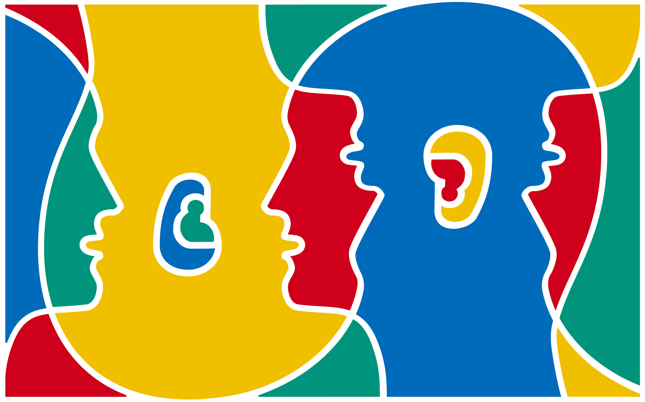
I liked this because, even though it has way to much color, it still shows unique quality. I also like how it had no words. There are mainly primary colors, giving it an almost childish affect. But the small amount of secondary colors make it more mature. I liked how the colors were seperated by white lines, instead of black, because you would expect black, yet it gives you white.

glu. (Online Image) Available http://www.gossipgamers.com/look-out-for-modern-warfare-2-on-mobiles/ . September 23, 2010.
I thought this was cute, and I liked how the letters wern't overly elabourate. I liked how the letters were colorfully yellow, curvy, and thick. I also like how the g's eyes are not black, but gray, because black would have taken away from the overall affect.

SociSaurus. (Online Image) Available http://www.ivelina.com/2010/06/sociosaurus-com-logo/ . September 23, 2010.
I love this logo, the baby Triceratops is adorable! I'm not a huge fan of blue and pink together normally, but this almost swayed my opinion. Almost. I also like how the blue dino sits in an uncentered circle, and how the letters have texture and reflections.

I LOVE your apple and fish iphone logos THEY ARE SOO COOL!
ReplyDelete